Crypto Broker
Coinmerce is a leading cryptocurrency broker in the Netherlands.
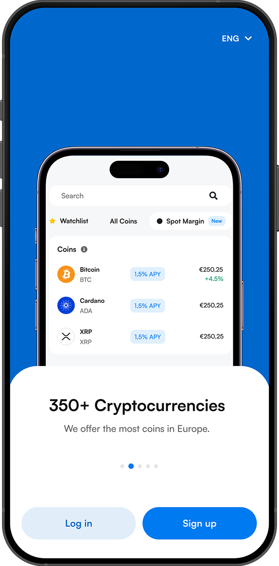
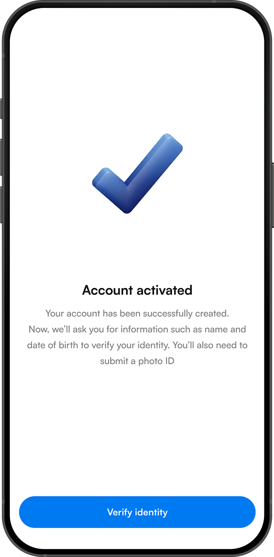
Coinmerce provides users with a simple and secure platform to buy, sell, and manage digital assets.
Objective
The primary goal was to redesign the entire mobile application to create a more intuitive, compliant, and scalable user experience.
My Role
I owned the full product lifecycle, end to end. From initial discovery and design to project management and monitoring after going live.
Problem Statement
The existing application had accumulated significant usability issues over time, creating friction across critical user journeys and negatively impacting both the customer experience and business performance. A comprehensive UX audit, supported by customer feedback, support insights, and user research, identified several areas requiring improvement. These findings informed the redesign strategy and established a clear roadmap for creating a more intuitive, scalable, and conversion-focused product experience.
Key findings included:
- Inconsistent and outdated user interface patterns.
- Complex onboarding and transaction flows.
- Low discoverability of key features.
- Compliance requirements that introduced unnecessary user friction.
- A lack of a scalable design system.
- Recurring user frustrations identified through customer feedback and support channels.
- Revenue-impacting UX issues within key conversion flows.
Audience
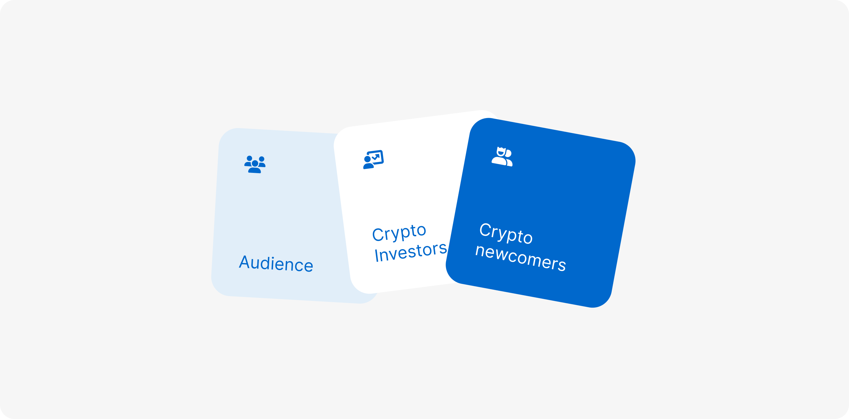
From the start, we aligned on Coinmerce’s key user personas. The goal was to create an accessible and trustworthy experience for both experienced crypto investors and users who were newer to digital assets, while accounting for differences in their knowledge, confidence, and trading behaviour.
Crypto Investors
Experienced with crypto and financial products, typically more confident navigating complex features, actively monitor the market, and expect fast access to trading, portfolio management, and advanced information.
Crypto newcomers
Limited experience with crypto and financial markets, less familiar with industry terminology, need clear guidance and reassurance, and primarily use Coinmerce to buy, hold, and understand crypto without unnecessary complexity.
The process
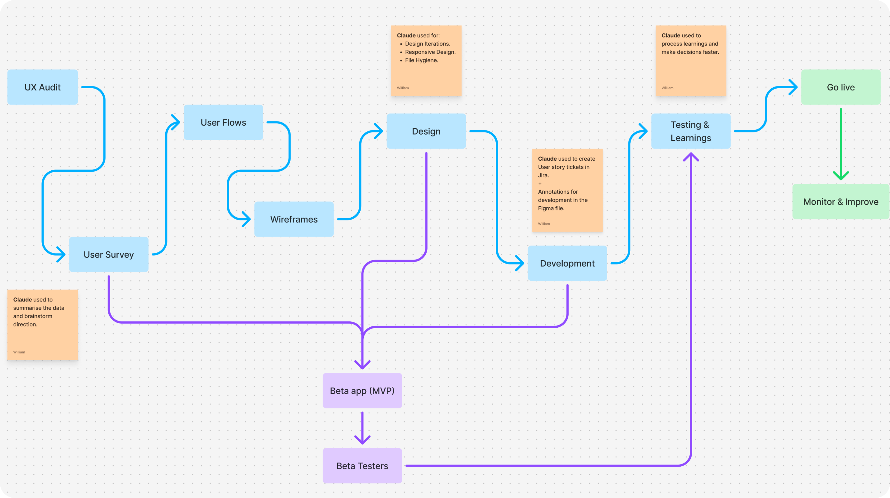
I started with a UX audit and a user survey to understand where the product was failing and what users actually needed. Those insights shaped the user flows and wireframes, which moved into design and then development. Alongside the main track, we shipped a beta MVP to a group of testers, and their feedback fed directly into testing and learnings before go live. After launch, the work shifted to monitoring and continuous improvement.
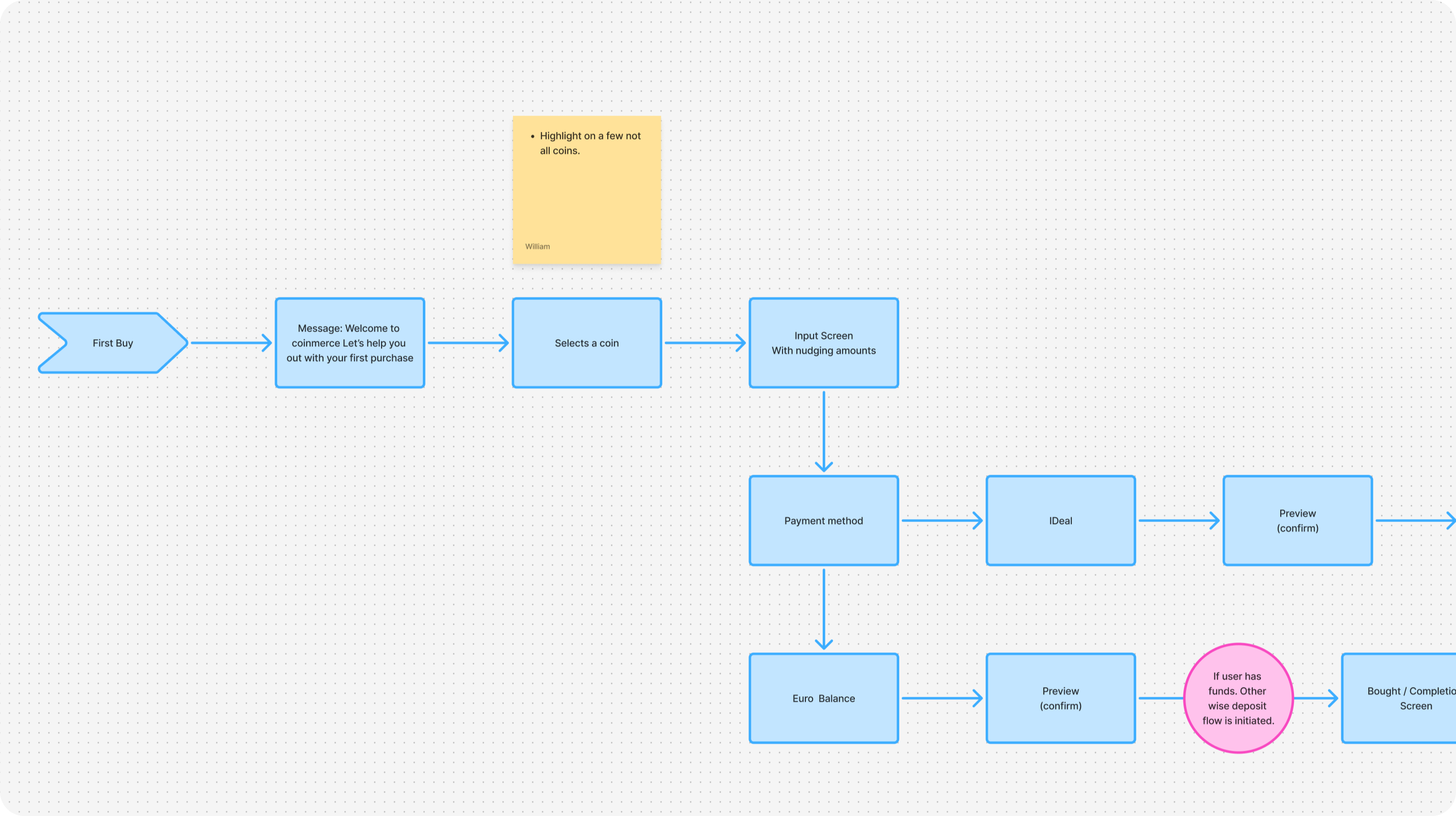
User Flows
Mapped the core user journeys (first buy, deposits and recurring flows like Crypto Savings) end to end before touching wireframes. Each flow was stress-tested for drop-off points and edge cases (partial fills, failed payments, KYC gaps) so the interface could be designed around real failure modes, not just the happy path.
98 Flows
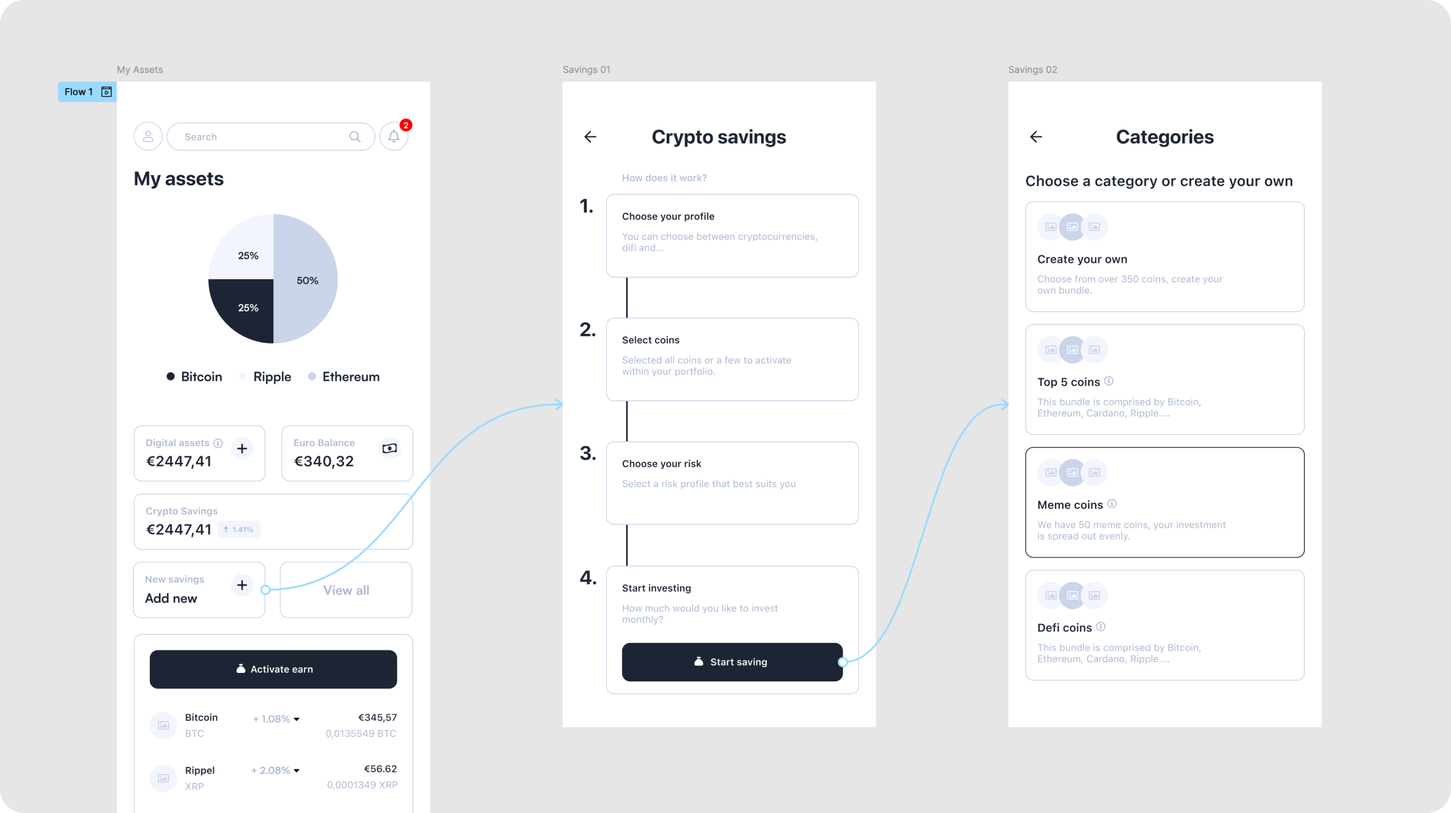
Wireframes
Low-fidelity flows for the two highest-friction areas: portfolio overview and Crypto Savings setup.
Wireframes were validated against the UX audit findings before any visual design started, keeping structural decisions separate from styling decisions.
144 Screens
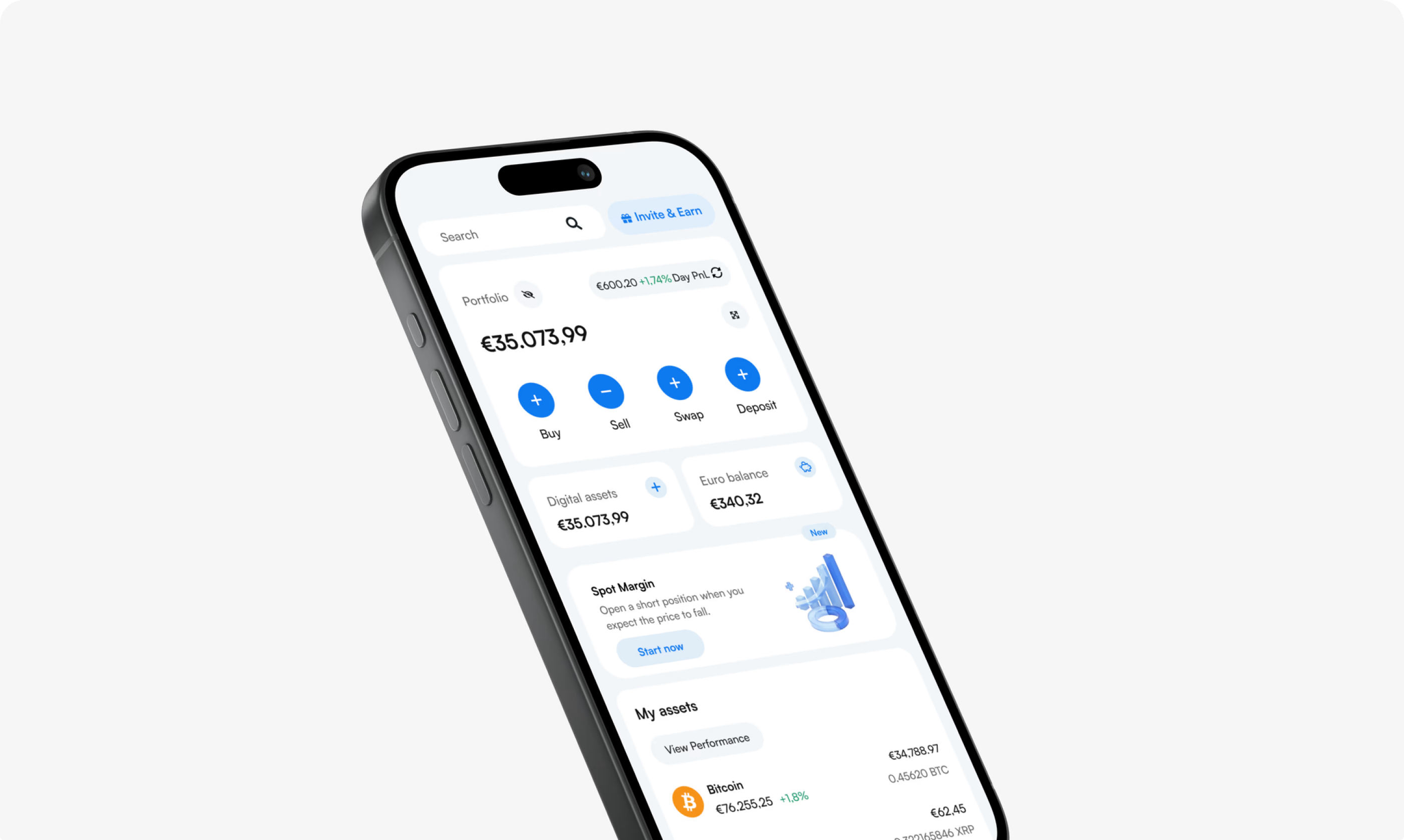
Visual Direction
Landed on a bento-style layout of modular cards that group related data (balances, allocation, assets) without forcing users to parse a single dense table. It scales cleanly across screen sizes and made room for progressive disclosure on complex features like Spot Margin.
332 Screens
Key Flows
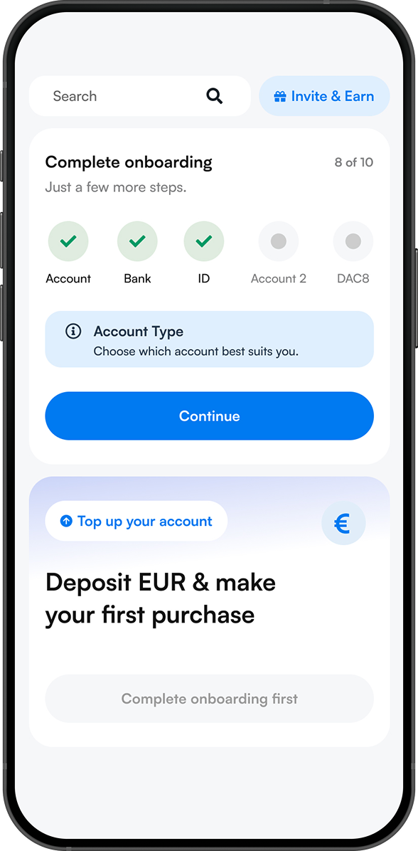
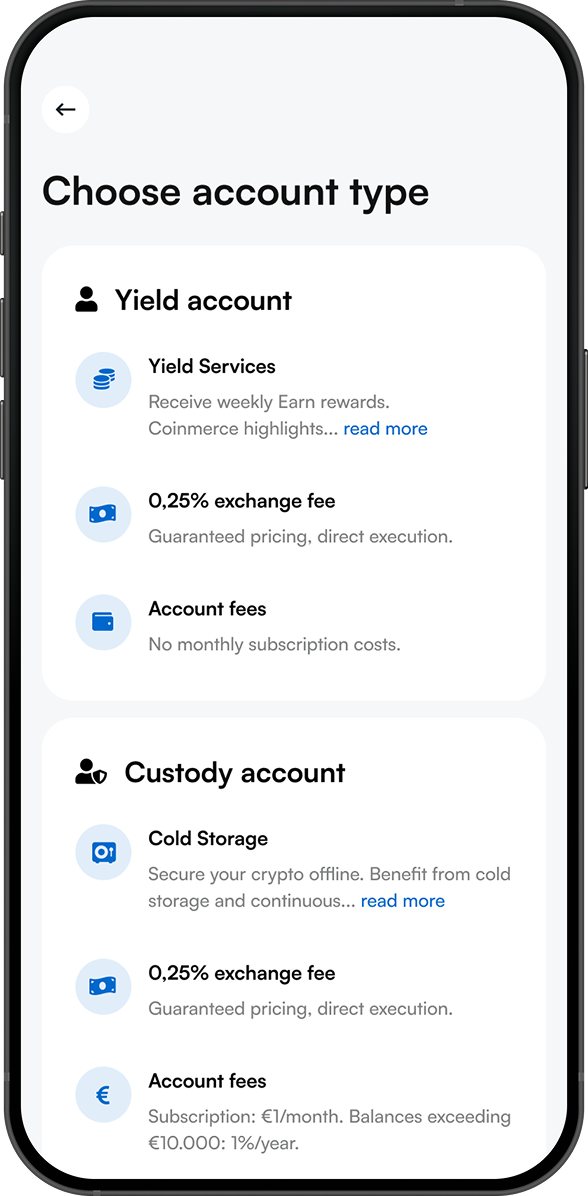
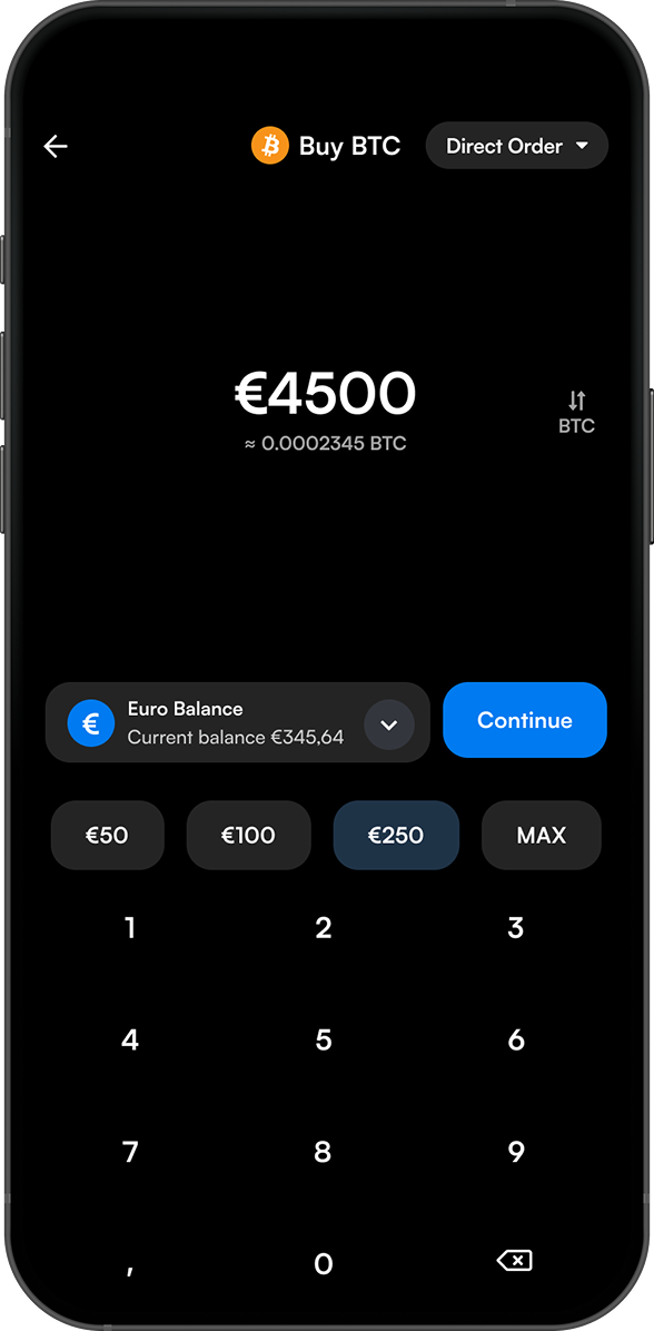
These three flows carried the most weight for both personas. Onboarding activation turns account setup into a visible checklist, so new users always know how many steps are left and what comes next. The account type screen puts Yield and Custody side by side with fees and benefits up front, so the choice is clear before anyone commits. The buy flow keeps the amount front and centre, with quick-select values and the euro balance visible, so a first purchase takes seconds instead of guesswork.
Results.
After launch, the redesign improved performance across the full funnel, from signing up to funding and making a first buy. Fewer users dropped off during onboarding, more completed their transactions, and support tickets went down as the flows became easier to understand. Figures compare six months after launch with the previous version of the app. (*6 Months monitoring, compared to the same timeframe and market movement as old app.)
Increased Onboarding Conversion
Completion, Transaction Flows
Activation First Fund + Buy
Increased AUM
Reduced Churn
Less Support Tickets
Figures shared on request, by email.
More flows
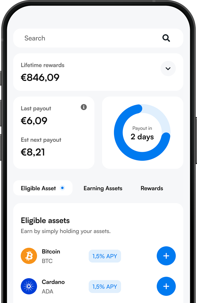
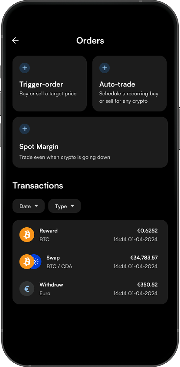
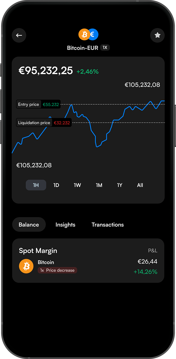
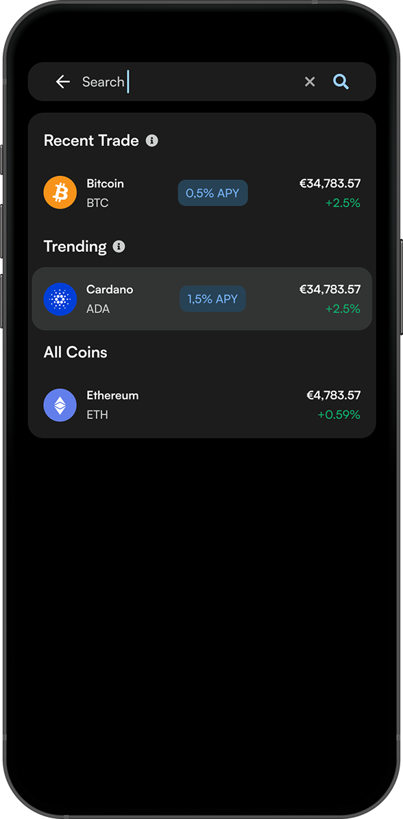
Beyond the core journeys, I redesigned the features experienced investors rely on most. The order overview brings trigger orders, auto-trade and Spot Margin together with a filterable transaction history. Spot Margin shows entry and liquidation prices directly on the chart, so risk is visible before a position is opened. Smart search surfaces recent trades and trending coins first, so finding an asset among 350+ options doesn’t mean scrolling through all of them.
Design System
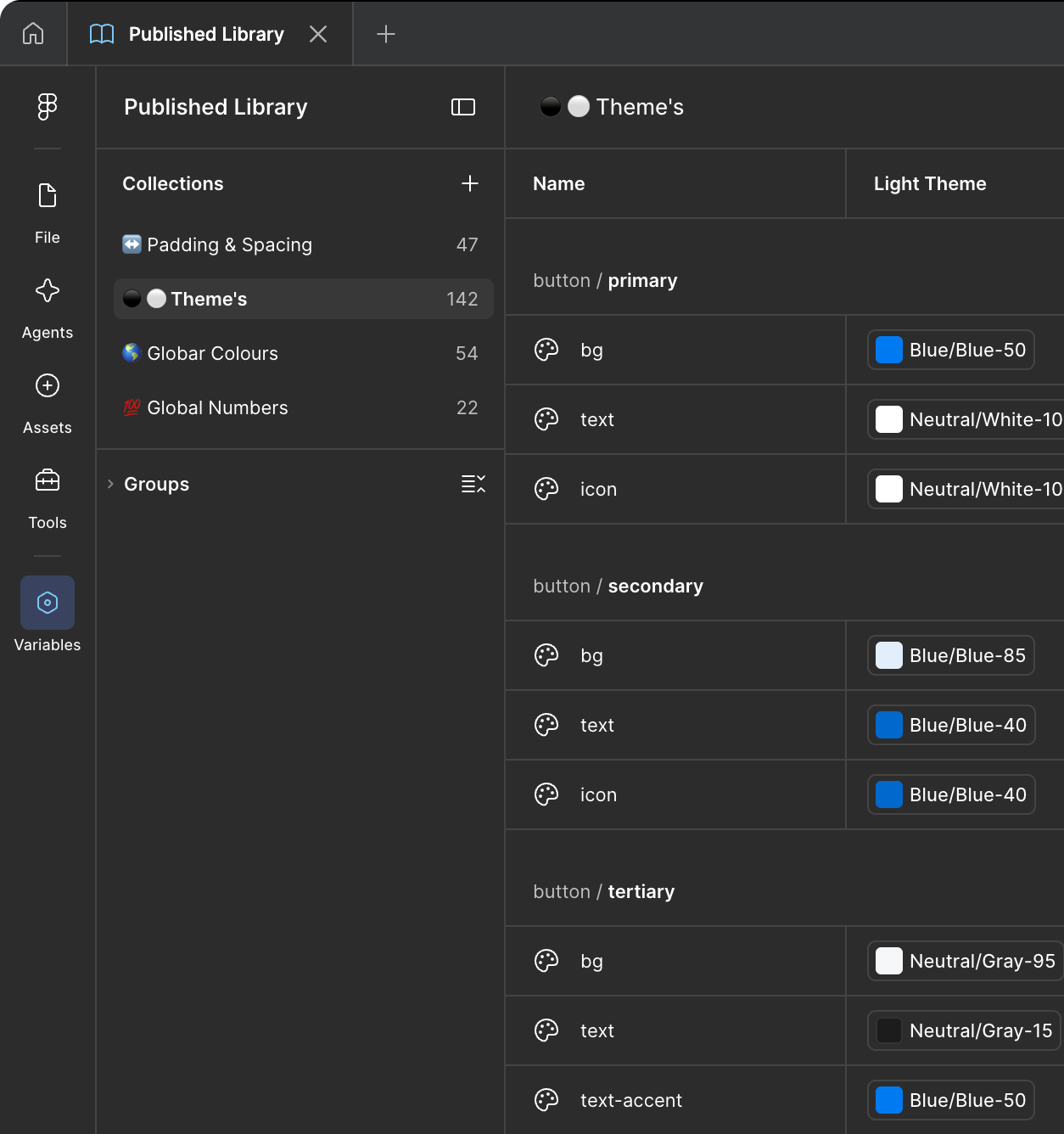
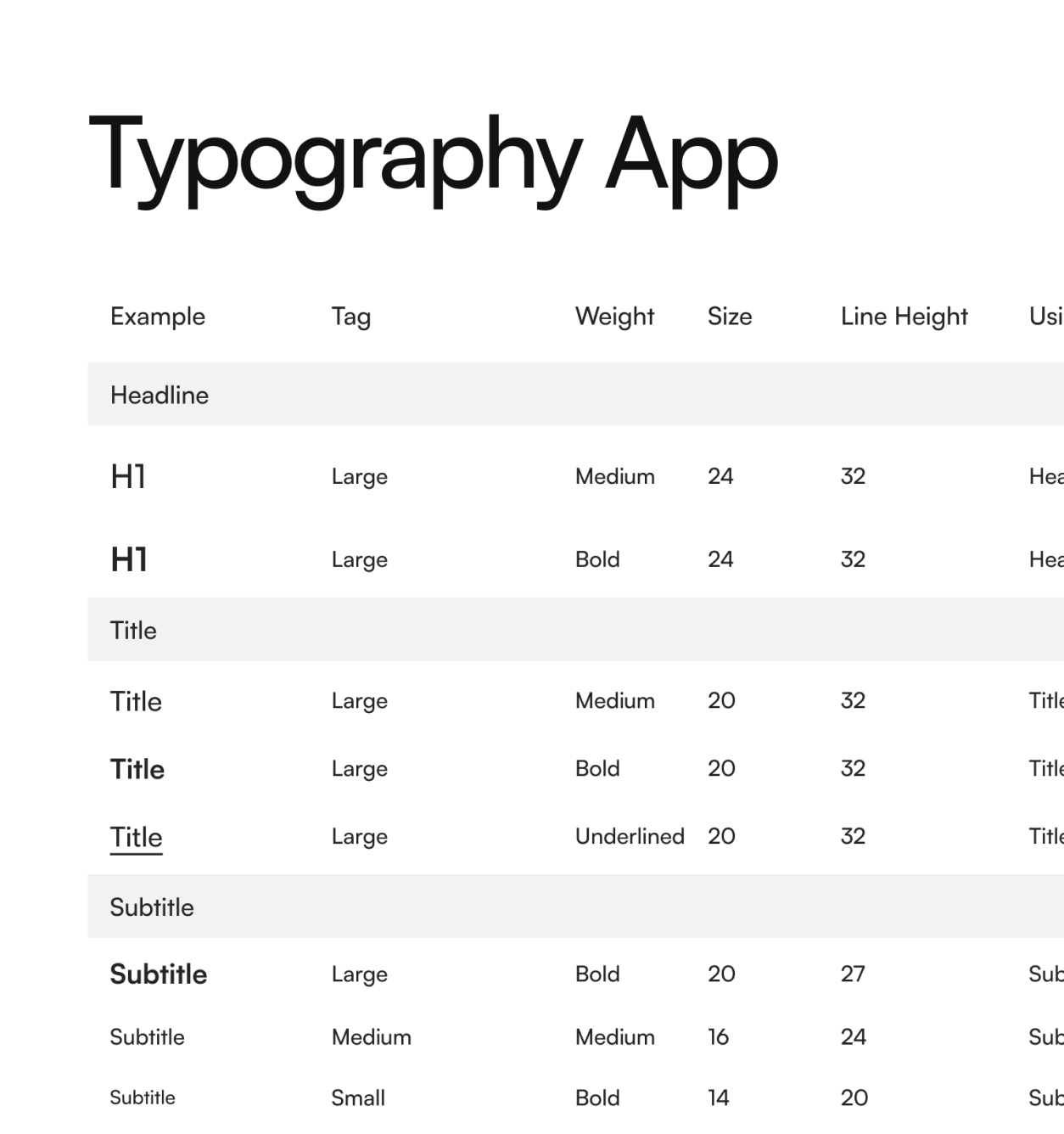
Built a token-based design system in Figma covering colour, spacing, and component states (default, hover, pressed, disabled, error), paired with a typography scale for headline through label sizes. This gave engineering a 1:1 source of truth and cut implementation inconsistencies across the 2-engineer build.
Leveraging AI
I worked with Claude throughout the project as a practical collaborator. Agent Dieter supported me through brainstorming, design iterations, responsive design, file hygiene and dev annotations in Figma.
A second agent, Sayonara, turned the designs into user story tickets in Jira. AI also helped me summarise survey data and process test learnings, which shortened the time between insight and decision.
Agent Dieter
Senior Product Designer
Agent Sayonara
Senior Product Owner
Learnings:
This project gave me full ownership of the product lifecycle, well beyond design. I planned the work, wrote requirements, tracked progress in Jira and acted as app release manager. I also learned how to onboard and manage external teams alongside internal ones, keeping everyone aligned on the same scope and timeline.